I tend to have a personality that is a little bit particular. I don’t think I’m approaching obsessive compulsive but it does bother me if certain things aren’t done just so. This trait of mine has found its way into my shooting and how I digest a given performance.
Whether I’m Shooting USPSA, IDPA, or Archery, I like being able to come home after a match and take a look at how I performed. As I delved deeper into the sport of archery, I quickly found that seeing my final score, and nothing more, posted on a club website just wasn’t enough to satisfy me.
At this point I did what any tech enthusiast would do, I reached for my phone and began researching archery apps. I found what seemed like an endless supply of virtual archery games but few apps that would actually be useful on the range.
One of the first archery apps to be loaded onto my iPhone was ArcherZUpshot. I opened the app for the first time and didn’t get the greatest first impression. While the app is jam-packed with features, it had a clunky look and feel.
I spent a little time poking around in the app and setting it up for my Bow and Arrows. I played around with entering shot data but ultimately lost interest and found myself back on iTunes, looking for other apps.
It wasn’t until a couple of weeks ago that I decided to give ArcherZUpshot another try. I’m glad I gave the app another shot because the more I use it, the more I like it.
What I Dislike
The biggest hurdle I’ve found with ArcherZUpshot is getting past the interface. I can’t put my finger on exactly what bothers me about it but it just strikes me as clunky.
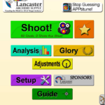
It annoys me to no end that every button press is followed by a slight delay then a graphic transition from one screen to another. Some of the buttons feel like they are in unnatural positions. For instance, as you move down a screen entering data, you then have to go back up and to the left to press the next arrow (which is next to the back button – I don’t know how many times I’ve accidentally gone backwards when I meant to go forward).
I think that if the variety of colors were pared down and screens were a bit more organized, I would be much more inclined to use the app.
What I like
How many times have you found an interesting app and hesitated to download it because it wasn’t free and there was no trial version? The nice thing about ArcherZUpshot is that it is a full featured app with a built in 500 Shot Free Trial.
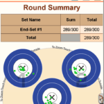
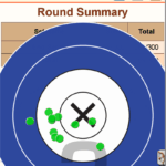
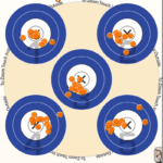
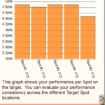
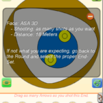
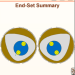
One great feature about this app is that it allows you to drag and drop arrows for score. The app tracks those arrows and allows to analyze them at the end of the round. You can then share those results with friends via Twitter, Facebook, or Email).

Wish List
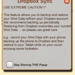
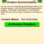
I have found that I prefer entering data on my iPhone and then reviewing that data on my Google Nexus 7. While this is easy enough to do, I wish the process to transfer the data was automatic. As it stands I have to backup the database from my phone, to DropBox, then restore it on my tablet.
ArcherZUpshot is limited to a single Archer. While this is great for practice and shooting spots, I wish it supported simple scoring for a group of archers. I think this type of feature would be great for occasions when I shoot a practice field course with a friend or two. Right now I’m using a separate app to handle group scoring.
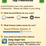
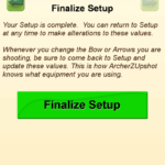
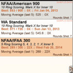
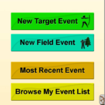
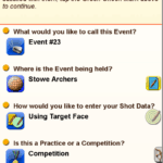
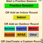
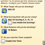
Screenshots
Try It!
With a price tag of FREE, there is no reason not to install ArcherZUpshot on your mobile device. If you are looking for an app that will help you analyze your shots and improve, this is one of the best that I’ve found so far.
I’ve never been a fan of Numbered Ratings but I’ve decided to rate this one 4 out of 5 Stars. My only real gripe at this point is the look and feel of the app. The features are where ArcherZUpshot really shines.
What Is Your Favorite Archery App?
One thought on “ArcherZUpshot App Review”
Comments are closed.
Recent Posts
The Price of Rushing: A Winter Riding Story & Four Years of YouTube Friendship
You know those moments when you do something that isn't exactly catastrophically stupid, but just stupid enough to make you shake your head at yourself? Yeah, we've all been there, and today I'm...
Finding Joy in Unexpected Places: A Memorable Motorcycle Ride to Remember
As we roll into 2025, I've been reflecting on the rides that made 2024 special. While the year didn't provide as many opportunities to hit the road as I'd hoped, one particular adventure stands out...




Hey, Walt!
This is an excellent review – clearly you did your homework – and you make some terrific points. And thank you for your kind words!
If you’ll allow me to answer, I think you might like what you read:
The user interface appears “clunky” to more than just you! Personally, I like all the crazy colors, but since this isn’t about what I like, we are toning it down. The next release will have fewer colors, and the colors will have navigational meanings.
The delay after the button press has been a sore spot for me since the beginning (I’m OCD too.) It appears to be an issue with the development platform – believe me, we didn’t put that in there on purpose! If we can figure out how to make the transitions smoother, we will…. if we can’t, that alone might mean that we eventually migrate to a different development platform.
Button position is another issue that we’ve received change suggestions on. In this next release, you will see some of the “trouble buttons” in new positions. Once everyone is used to the new button locations, I believe it will flow better — but as always, we’ll see how it goes and modify again if it “ain’t right” yet.
I’m glad you mentioned the Dropbox interface. It was great when we added it – before that, if your phone hit the toilet, your data went with it – no backup. But it was always intended as proof of concept for Cloud integration, and that is coming — soon. Not in this next release, but probably this summer. At that point, you’ll have the option to sync manually, or automatically whenever connectivity is available.
We’ve had numerous requests for multiple archer support, and I’m happy to tell you that at long last, that’s coming too. I can’t say for certain at this point when, but it most likely come either with the Cloud integration or shortly thereafter.
I’d love to see you write a second review, concentrating on the Analytics. That’s the stuff I love the most!
One final point, if I may — when you become an ArcherZUpshot user, you’re not just getting an app. Although I’m not the programmer (that’s my husband), I make myself available to all users as much as possible, and respond to user input as rapidly as I can. I’m on Facebook, Twitter and Archery Talk nearly every day, and the email link inside the app comes right to my desk. We pride ourselves in getting suggestions implemented as fast as humanly possible – whether that is fixing bugs (yes, we do have them!), adding Rounds folks want that aren’t already there, or changing colors and moving buttons. I actively solicit input, good and bad, every single day, from users. We attend archery events like the Vegas Shoot for the sole purpose of making ourselves available for questions, tutorials and suggestions. (OK, well, Marc actually shot at Vegas, but I did ArcherZUpshot all day every day!) We both do this full time… but there are only just the two of us. While we do implement suggestions quickly, we have a “List” about a mile long — and all great ideas! So if you have a wish list — and I see you do! — get in touch! If it’s not on our “List,” I’ll put it there, and sooner or later, your wish will be granted.
Unless of course you wish for a perfect 300 with 32xs. I can’t give you that – but I can give you the tool to help you get there! 😉
Thanks again for this fantastic and very constructive review!
Fern Slack
President
ArcherZUpshot